
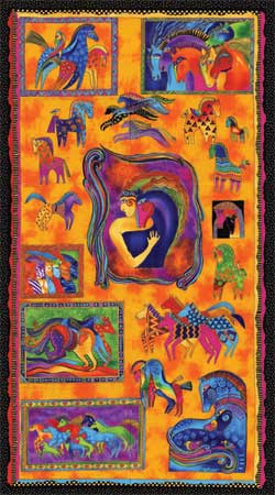
The woman in the center with the horse
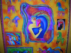
just seemed so "Warrior" to me that I thought it would be appropriate. Also, I like bright colors... ;0)
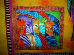
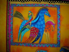
Here's a couple of closeups of the figures in the panel so you can see where my inspiration for the design came from:
I had to increase the width to make it work within the 50" x 60" lap quilt size. I played around with some different combinations of side panels and finally went with these. It took a bit of playing with leftovers but I got it done!
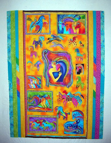
I think this worked pretty well. It might have been better if I had taken the outside bits of black and yellow banding off, but I think it will be fine this way.
I wanted an inner border using two colors (to stay with the wonkiness of the whole concept)and then an outer border of the dark blue to pull the eye from the center with the woman out to the border, and vice versa. Here's the inner border of pink and green just laid out on the design wall...
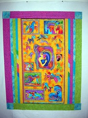
The pink and green are the same value so (to my eye at least) they work well together.
Here is the outer border added on. The striped corners reflect the stripes painted on several of the horses in the panel and were the starting point for my design. I didn't quite have enough blue fabric left that was long enough so I had to add some pink and green rectangular pieces on either side of the striped corner block.
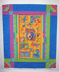
I do like it better with the extra rectangular pieces added, though!
In fact, I like it alot; however, I'm really a novice at this and am just feeling my way along. I know it is bright but to my mind it needs to match the panel intensity.
So, I'm asking your opinion if I may... does this design work or do I need to try something else? Maybe different colors? Not so many stripes?? Any suggestions welcome... well, I won't start completely over!
10 comments:
Wow, what a beautiful quilt!
I like it just the way it is. The stripes in the corner balance the center panel and the colors are perfect, they echo the colors in the panel. I especially love those diagonals in the sashing. Smashing! If I could make one suggestion, I would use a deep blue for the binding, the color of that darkest blue in the center.
Well done, Marty!
I think it is Super!
My only suggestion would be to send it to me! *wink*
It is full of life and color--a real feel happy kind of quilt. Kudos!
Are you kidding, Marty? This is wonderful!!!!
Oh, Yay... thanks everybody... and no I'm not kidding, Allie! I still don't really trust my eye when it comes to quilts... gardens, yes... quilts, not so much! Especially when it is for someone I don't know, I kinda feel it needs to speak to several people and not just me.
Thanks, people!!! LOL!!
I forgot... Rian, I have just the right deep blue fabric in my stash for the binding... thanks for the suggestion, it will be perfect!
It's just beautiful, Marty, and will be well received by someone. Great borders!
It's really striking-someone's going to get wonderful energy from those colors and I love the idea of the Warrior theme. Great work!
Wow! That is absolutely gorgeous!! What an incredible job you've done!
HUGZ:)
Candi
What a fantastic quilt. Don't you just love Laurel Burch's designs. I really like the design you came up with.
Post a Comment