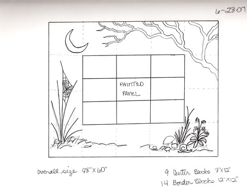
Hokay... at Allie's suggestion, I played a bit with the second design last night, trying to put the painted fairy panel in the center. When I originally came up with Design 2, I used the dimensions of a
Golden Rectangle to get a proportion that is very pleasing to the eye. I kept trying to get the same proportions with a center panel (also a golden rectangle) but just couldn't get it done without making the quilt too big. I need to keep the quilt to a manageable size so I can find room to hang it in my home!
Anywho... this is the design that I came up with:

(click to see the entire design)
How does this work for you lovely ladies?


4 comments:
Oh Gosh, I love it so much I want to do one just like it!
But I would make the painted panel a tad larger in size than the blocks in the border surrounding it, if that is possible, just to make it more prominent.
Beautiful, Marty!
Works for me, totally! But Allie has a point, make the "border" blocks smaller so the center one is more prominent. Even though the golden mean is a smart idea. Let's see it both ways?
This one appears balanced, and whatever you do to change block sizes in the middle, if anything, as long as the total stays the same, it should still be balanced. I wonder if setting off the painted panel with another border might help to focus on it? It would definitely make the other blocks smaller. Or at least 4 of them.
I love this design but I also love the full moon behind the branches in your first sketch. Full moons feel more Titania-ish somehow.
Post a Comment